
Christine Foust Dawe
Tech copywriter & content strategist
Content strategy & copywriting
AT&T
Att.com Digital Experience | Content strategy, copywriting, copyediting
On AT&T's Digital Experience content team, I've owned and managed the content for over 100 articles across AT&T email, security, and DSL Internet products. I provide content strategy guidance on how translate industry jargon and instructions into friendly, problem-solving content. Some major projects have included a complete knowledge management system migration and site redesign from 2015-2016, AT&T email rebranding, U-verse rebranding, and the migration of the att.net login portal and AT&T email away from Yahoo in 2016.
My work has doubled the number of articles in my content areas, improved user experience, added multimedia elements to content, reduced call rates, and consistently improved customer satisfaction rates.
 Security landing pageWrote copy and collaborated on wireframes for new landing page template design that served as a template for further landing page development throughout att.com/support. |  Security landing page (down) |  Internet security |
|---|---|---|
 Wireless device security |  Internet Security Suite product pageContent strategy and copywriting for att.net content pages. |  Email fraud page |
 DSL and Internet support articles |  Email support articles |  Setup email on a wireless device |
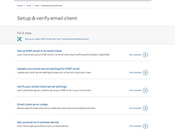 Taxonomy and snippet writing |  Learn about McAfee |
Samba TV
Content and brand strategy, copywriting
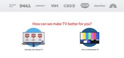
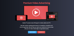
I worked with Samba TV at two pivotal points in their company. The first time was to provide content strategy direction and copywriting in the midst of their rebranding and transtion from Flingo to Samba TV. The second time was to rework and polish their content for a major PR initative, sort of an official launch and media push for the brand. Samba TV is a "smart TV" company, and I was faced with the challenge of explaining what their company does and how the product works while also needing to lay a foundation for users unfamilar with the emerging world of smart TV technology.
 |  |  |
|---|---|---|
 |  |  |
 |  |  |
 |  |
Cheeky Chicago
Rebranding, website redesign, social redesign | Content strategy, copywriting, copyediting, social
This online Chicago women’s lifestyle magazine had an outdated site with a confusing, stagnant homepage, a navigation that left content hidden, and a general pattern of missed opportunities to engage users. I walked the clients through a rebranding strategy and developed a content matrix to assist with migration, restructuring, and redesign of the site. With a new taxonomy in place, I created new, branded section headers, homepage features, section slideshows, captions, and banners. My team also added breadcrumbs, an author database and tagging system, search capability, commenting, and social integration.
Almost immediately after the site's launch, the bounce rate was reduced by 60% throughout the site, with visitors spending 4x longer on the homepage and 10x higher click-through rates. The overall user experience and engagement levels improved dramatically.
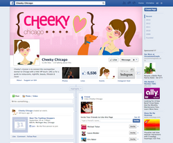
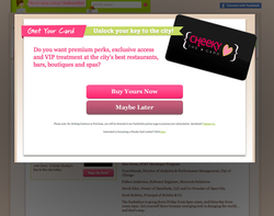
 Cheeky homepageExpanded the homepage, which was formerly just a calendar, into a dynamic page with clear tie-ins to their content-rich magazine site, such as the "editor's picks" (see the next slide). Also added branded navigation/section names. Social integration was added to further emphasize the brand as facilitating a dynamic community. |  Cheeky homepage pt2 |  What is Cheeky Chicago?One of the original website’s biggest problems was the lack of “about us” information—it was almost impossible to figure what the site was really about. I created the “Meet Cheeky” section to explain the site and get to know the company and the founders better. The idea of Cheeky as the “key to the city” was the slogan I created to drive home their value, and it was used again to tie in the launch of their Cheeky Card. |
|---|---|---|
 Fit'n'Pretty sectionThis is where Cheeky’s breadth of content was given a chance to shine. I designed the landing page of each section with a featured article of the week, with the additional new content from other subsections/blogs following down the page. |  Scene & Be SeenAn example of a section that formerly had 20+ different pages consolidated down into a manageable amount of topics. |  Section pagesThe "Even More" breadcrumbs (after the site's first time having the taxonomy cleaned up) remind users of each section’s additional content, and these new features allowed for specialized media buys. Also, created a new format and database linking system for displaying and linking to writer profiles. |
 Social page redesigns and rebrandingFor the redesign of Cheeky’s social pages, I wanted the copy to be a bit more sassy and casual to better fit the pages’ function. We also implemented a couple temporary FB apps on their page to push newsletter and event sign ups. |  Cheeky Twitter redesign |
The Cheeky Card
Membership card program | Content strategy, project management, copywriting, social and marketing integration
Before the launch of the new website, Cheeky wanted to capitalize on the increased traffic to their site with a new monetizing opportunity. They wanted a membership card that offered exclusive discounts and deals with preferred vendors. I created the card name and tagline and set to work explaining how the card worked. As the project manager, I pulled together a team of developers and a designer to create a system involving merchants using a iPhone, iPad, or (eventually) Android device to scan the unique QR code on the back of each member’s card to activate the deal.
At the website and Cheeky Card launch, hundreds signed up for the new program. Their card quickly became a successful branding tool and monetizing solution.
 The Cheeky Card |  Cheeky Card about page |  Join the club/perks preview pageI named the Cheeky Card deals “perks” to directly avoid discount language, hinting at more exclusivity and higher value. Phrases like “Check it out” also kept the tone friendly and not too eager. |
|---|---|---|
 Sign up lightbox |  Continue to fanfueled |  Payment page |
 QR Code Reader iOS AppThe email was sent to a merchant after their contracts were signed. This application allowed the Cheeky Card merchants to scan the QR code on the back of a member's cards to redeem their perk. |  Banner adsCheeky wanted banner ads for their site that could also be placed on other sites if they chose to do media buys. They wanted to feature lots of the features of the card mentioned, and this resulted in animated banner ads that flipped through all of these examples (and more). The ad conveyed the sense of VIP status that was essential to its perceived value. |
Sunology
Website redesign, marketing, and social campaigns | Content strategy, copywriting
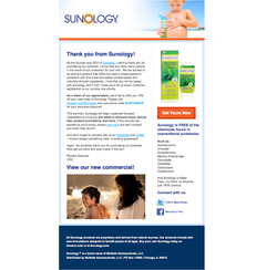
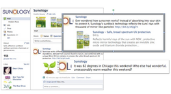
The website for a new sunscreen brand needed a major user experience, content, and design overhaul as well a functioning e-commerce solution. In the small digital agency I worked for, I was brought on to manage a website refresh, create a social presence, create a branding and content strategy, write content for the site, a blog, and social, and develop a marketing plan to promote the brand. With a shoestring budget, I also chose images for the designs, assisted with a reorganization of the site, created product descriptions, and optimized the site for SEO.
After the site was complete, bounce rates reduced dramatically, click-though rates and time on the site hit our goals, the brand had cohesive messaging, and users were able to make purchases.
 |  |  |
|---|---|---|
 |  |  |
 |  | |
 |  |
ATG - Attorney's Title Guarantee Fund
Website development and design | Content strategy, copywriting, copyediting
For years, whenever ATG had something to add to their site, they simply created a new page, over and over again without any reorganization or removal of unecessary content. When they approached our agency, they had over 200 pages of content and major structual problems, open content was accidentally password-protected, and an overall disorganized and overwhelming user experience.
I performed a content audit, created a content matrix and new sitemap, and sketched out some wireframes, ensuring that all necessary content would have a home in the new navigation. Over the course of the project, I worked with the design and development team to migrate the site to the new platform and design, while creating templates and content to help guide future updates to the site. The new site produced dramatic increases in click-through rates and user engagement, including membership applications.
 ATG Homepage |  Subsections |  Interior page- calculator |
|---|---|---|
 Wireframes |  site mapping |